Volume 4, Number 1 - Fall 1995
© Logo Foundation
You may copy and distribute this document for educational purposes
provided that you do not charge for such copies and that this
copyright notice is reproduced in full.
These are the major articles that appeared in Logo Update,
Volume 1, Number 4 - Fall 1995. Minor changes have been made to
update information such as addresses. Conference announcements and
other items of transient interest that appeared in the original
newsletter have not been included here.

In this issue:
Logo as a Window into the Mind by
José Armando Valente
The Turtle is Dead: Rethinking Logo in the Age of
Kid Pix by Michael Tempel
The Case for Classic Logo by David L.
McClees and Dorothy M. Fitch
 [TOP]
[TOP]
Logo as a Window into the Mind
José Armando Valente
If we could "penetrate" into the student's mind to find misconceptions
and bugs, we would be able to intervene more effectively to help the
student to learn better. Even though this was desired by many teachers,
the reason it wasn't done is that we did not have good ways of getting
into the mind. We didn't until we had computers!
 Computers have provided us with the possibility of penetrating
into the learner's mind in ways that we never had before. Artificial
Intelligence and Cognitive Science have benefited from this
enormously. And in the Logo community, especially within the group
working with handicapped children, it was common to hear that Logo
provided us with a "window into the child's mind" (Weir, 1987). The
argument was that a Logo program had imbedded in it the student's
concepts, strategies, and styles, which could only be the product of
his mind. Looking at students' programs we could have ways of
understanding how their minds worked in the process of developing the
programs, and the level of knowledge, strategies, and style used.
However, the current uses of computers in education and the
educational software available have minimized programming activities.
The emphasis of computer activities has been on the creation of
finished products with minimal effort. It seems that this line of
thinking undermines one of Logo's original objectives and dismisses
important characteristics of the computer as a tool for enhancing
learning.
Why Programming?
Any intellectual activity can be seen as a window into
the mind. However, there are important features of programming that
allow us to penetrate into one's mind that we did not have
before.
The discussion about "why programming" is a current topic in the
Logo literature. Seymour Papert presented several examples in which
programming allows the computer user to have better control over the
computer (Papert, 1993). The reason Papert prefers programming over
ready-made educational software is that "discovery cannot be a setup;
invention cannot be scheduled" (Papert, 1980, pp. 115). "Is
Programming Obsolete?" (Clements and Meredith, 1993) gives a summary
of an American Educational Research Association meeting in which
several speakers presented different views of programming.
Programming is "the best ever representational support for cognitive
activities" according to Andrea diSessa. Mitchel Resnick is cited as
describing programming "as an expressive medium." I certainly agree
with these views but I think that programming should be placed into a
theoretical framework along the lines of that proposed by Solomon
(1982).
The window into the mind emerges when one considers the process
of programming as a cycle consisting of
description-execution-reflection-debugging-description (Valente,
1994). When a student is using Logo (I will concentrate, for the
moment, on the graphics aspect of Logo) his initial ideas about how
to solve the problem are passed to the computer (or the Turtle) in
terms of Logo commands. Thus, the student is acting upon the object
"computer." However, this action is also a description of the problem
solution through the Logo procedures. The computer then executes
these procedures. The Turtle "walks through" each instruction in each
of the procedures and presents a result in terms of a picture on the
screen. The student observes this process and the final product, and
can reflect upon them. This reflective activity can lead to one of
two alternative actions: doing nothing, when the student accepts the
result presented by the computer and considers the problem solved; or
debugging, when the result is different from what the student
intended or the result is not accepted by the student. Debugging can
be either in terms of concepts in the subject area (the student does
not know about angles, for example) or about some convention in the
Logo language, or about strategies (the student does not know how to
apply a particular concept.)
The cycle
"description-execution-reflection-debugging-description" allows us to
understand the learning process a little better, and why programming
can be an effective activity for learning. In this cycle, debugging
constitutes a unique opportunity for the student to construct his
knowledge; to learn about particular concepts involved in the problem
solution, and/or about problem-solving strategies. However, the
debugging activity is facilitated by the existence of the computer
program: the student's description of his ideas in terms of a formal,
precise, and simple language. Also, there is a direct correspondence
between each command and the computer's action, as reflected by the
Turtle's behavior.
It is important to say that the cycle,
description-execution-reflection-debugging-description, is part of a
programming activity in any computer language. However, Logo graphics
has added some aesthetics to this process in terms of simplicity,
structure, and feedback. Interaction between the student and the
computer is simplified with the use of terms used in everyday
conversation, making the description of spatial problems in synchrony
with intuitive spatial knowledge. The ease in naming and defining
procedures facilitates the problem-solving process. Turtle graphics
enhances the feedback from the computer, which feeds the reflective
process. All these features were introduced without compromising the
computational power of Logo.
Thus, it was the Logo aesthetics that made Logo such an important
tool to think about, and to foster, learning. It allowed us to
understand about constructionism: the how, when, and what that makes
the construction of knowledge possible. It has catalyzed
investigations into "learning about learning" since the student in
the process of looking for information is exercising his learning
skills. And it has raised questions about "thinking about thinking"
since the students can analyze their programs in terms of
effectiveness of their ideas, strategies, and problem-solving
styles.
However, we have learned that none of these phenomena will happen
by just placing a student in front of a computer. The
student-computer interaction needs to be mediated by a professional
who knows about Logo ideas. Students are part of a social
environment, comprised of their peers, their parents, the school, and
even the community. These social elements provide ideas, information,
and problems to be solved through the use of the computer.
Logo Aesthetics Can Transcend Logo Graphics
The activities that take place in the Logo graphics
environment are ideal for talking about the Logo aesthetics. However,
the Logo aesthetics can transcend the graphics activities, although
the aesthetics are much harder to implement in other educational
software or even in other domains of Logo.
In other Logo domains, such as list processing, music,
LEGO®Logo, and animation, the cycle of
description-execution-reflection-debugging-description is certainly
present, although each action in the cycle may not be as simple as in
the graphics domain. The music domain, for example, has all the
qualities of the graphics domain, although the description of sound
ideas in terms of frequency is not that intuitive; and the reflection
requires the ability to discriminate sound which can be a little
harder than the discrimination of forms. List processing, on the
other hand, is the domain in which the cycle is much harder to
establish. First, the description of recursive processes is not very
intuitive and it is not an everyday type of activity. Second, the
execution of a recursive list-processing procedure is very opaque,
making it impossible to see what the computer is doing. Third, the
feedback provided by the computer is often insufficient to facilitate
reflection. All of these factors make debugging a list-processing
procedure very difficult. However, with a proper debugging facility,
list processing can be less opaque, as was shown by Rocha (1993).
Thus, it is not by chance that Logo is well known for its
graphics!
Other computer software with menu-driven capabilities, such as
Kid Pix or Paintbrush, makes the construction of beautiful objects
very easy by just controlling the mouse. However, the fact that these
software applications are not programmable or that they do not leave
a trace when the activities are done, means that there is no
description of the activity. Without the description, the
description-execution-reflection-debugging-description cycle is
truncated, and certainly debugging is undermined.
Software such as HyperCard® and Control Lab have programming
capabilities in addition to powerful menu-driven facilities. However,
the programming capabilities of these applications present problems.
Either the type of programming they allow is simplistic to the point
where it cannot be considered a window into the mind, or too
intricate, providing a feedback that is hard to interpret, making the
reflective and the debugging processes almost impossible. The problem
with the programming capabilities in these applications stems from
the fact that they were not implemented with the objective of
facilitating the process of describing ideas. They are more concerned
with achieving a product. In this sense the emphasis of the product
design is on the computer, and the user has to mold his ideas to the
computer. The design of a good learning tool needs to put the
emphasis on the learner.
Even in the latest version of Logo, MicroWorlds®, we can get
a lot done by just controlling the mouse. However, if we do not have
a trace of these actions we have the same problems as we have with
Kid Pix or Paintbrush. Also, if MicroWorlds adds much more, to a
point that we have to ask "where's the program now?" (Adamson, 1993),
certainly we are not moving in the right direction in terms of
developing software to facilitate learning. In order to debug a
program, we should be able to have the procedures, the values of the
inputs that change the procedures' behaviors, and the results
provided by these procedures all in one place so we can facilitate
reflection and therefore debugging. If we have to look for the
procedures attached to turtles, to buttons, to colors, and then look
for sliders, we are distracting the user's attention from the
debugging activity.
In order to be able to facilitate the construction of knowledge
computer software needs to have certain aspects of the Logo
aesthetics to easily engage the student in the
description-execution-reflection-debugging-description cycle. The
software should have a programming facility, or the computer should
be able to collect information and construct a procedure as we select
items from a menu, or do things on the screen. Some software
developed within the visual programming paradigm has this feature.
The trace becomes the description, as in "Mondrian," a program
developed by Lieberman (1992).
Another reason that educational software should have these
facilities is to be able to help teachers to be effective in the
classroom computer environment. A teacher who interacts with many
students at the same time is not able to dive into a learner's
program and understand what is going on if the software does not
contain a description of the student's work. If it is necessary to
search for the program and/or if there is no trace of what has been
done, it will take forever to understand the student's computer
activity. Certainly this distances the teacher from the student's
intellectual process and undermines the effectiveness of learning in
the Logo environment.
Conclusion
In the early days of computers in education, Logo made a
big impact because it provided powerful computational facilities for
children and a completely different way of talking about education.
Some of these facilities, such as graphics, were revolutionary
considering the computer power available at that moment, and for many
years Logo was the only educational software that allowed students to
develop educational computer activities. The developers of Logo did
everything possible and impossible to implement these facilities
because they stressed important pedagogical issues. Even today the
pedagogical innovations introduced by Logo, the Logo aesthetics, are
an important landmark in education. People who still use and value
Logo today do it because of its aesthetics and because of its
potential as a revolutionary educational tool.
As the computer becomes more widely available in education it is
clear that today we have many more software applications to choose
from, each one requiring more or less effort to develop a final
product. We no longer need to "program" the computer to draw a little
house or to draw a sophisticated landscape scene. And that is fine if
the objective is to get the product done. However, if we want to
emphasize the use of the computer to enhance learning, we should not
lose the Logo perspective. The criteria should be whether the
software allows the student to engage in the
description-execution-reflection-debugging-description cycle, and how
effective each of the activities in the cycle is for the learning
process.
In terms of the development of new versions of Logo, a special
effort should be made to keep the Logo aesthetics clear and crisp.
However, we should think about new ways of describing ideas to the
computer. It does not need to be through a sequence of typed
commands. The new features added should be analyzed in terms of the
gains acquired in the process of facilitating learning and
penetrating into the user's mind. This means that the development of
Logo should be more an exercise about learning than the
implementation of a diversity of new computational features.
References
Adamson, E. "Where's the PROGRAM?" Logo Update, (2) 1, Fall
1993
Clements, D H. and Meredith, J.S. "Is Programming Obsolete?" Logo
Exchange, (12) 1, Fall 1993.
Lieberman, H. "Mondrian: A Teachable Graphical Editor" In Allen
Cypher (ed) Watch What I Do: Programming by Demonstration MIT
Press, Cambridge, MA, 1992
Papert, Seymour Mindstorms: Children, Computers and Powerful
Ideas Basic Books, New York, 1980
Papert, Seymour "Is Programming a Good Activity for Children?"
Logo Update, (2) 1, Fall 1993
Rocha, H.V. "Computational Representations as a Tool for Learning
Symbolic Logo" Proceedings of the III EuroLogo, Athens,
1993
Solomon, C. "Introducing Logo to Children: Teaching Logo Requires an
Awareness of Different Learning Styles" Byte (7) 8, 1992, pp.
196-208
Valente, J.A. "Computers in Education: Shifting the Pedagogical
Paradigm from Instructionism to Constructionism". Logo
Exchange, (12) 2, 1994, pp. 39-42.
Weir, S. Cultivating Minds: A Logo Casebook, Harper & Row,
New York, 1987
José Valente may be contacted at:
Núcleo de Informática Aplicada Educagco
Universidade Estadual de Campinas
Cidade Universitaria
Pridio V da Reitoria - 2 Piso
13083-970 Campinas
SP - Brazil
Tel: ++55 (192) 39 7350
Fax: ++55 (192) 39 4717
jvalente@ccvax.unicamp.br
 [TOP]
[TOP]
The Turtle Is Dead
Rethinking Logo in the Age of Kid Pix
by Michael Tempel
At a recent Logo workshop a teacher asked me, "Why do we need Logo if
we have Kid Pix?". I replied that Kid Pix can be used to produce a
drawing, but with Logo you also learn geometry and planning and
debugging skills while creating your picture. She seemed satisfied with
my response, but I really wasn't. Maybe I had given her a good teacher
answer, but is wasn't a good kid answer.
Here's an example of a turtle graphics project done 18 years ago
in the Brookline Logo Project, a research project conducted by the
MIT Logo group and the Brookline, Massachusetts Public Schools (Watt,
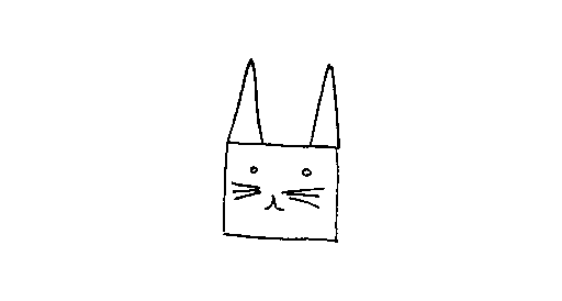
1979). Deborah drew a rabbit with pencil and paper and wanted to
duplicate the drawing using Logo.

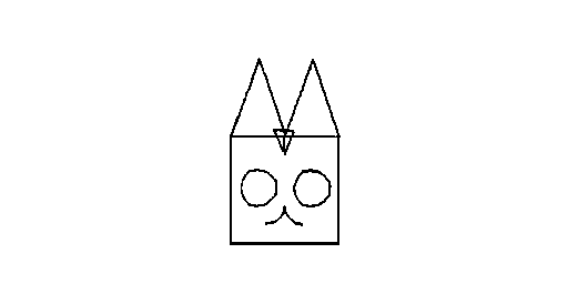
Her teacher suggested a modification of the drawing that would
make it easier to reproduce on the computer.

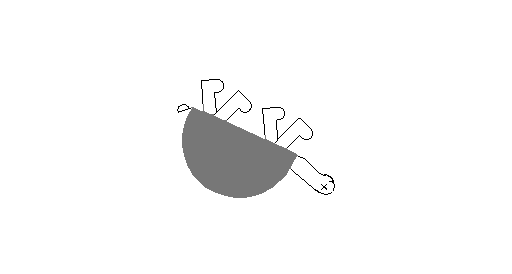
After two weeks of work, Deborah succeeded in creating her rabbit
using the Logo turtle.

In 1975, Logo was the best software tool available to draw that
rabbit. But today, you could do it in a minute using Kid Pix, or use
a scanner (which is what I did to get the images into this article).
But Kid Pix and scanners don't teach geometry! Hold on. Let's get
back to basics for a moment.
In Mindstorms, written in 1980, Seymour Papert tells us about the
criteria that were used to design a "new mathematics" for children.
What he said is worth quoting at length:
Turtle geometry started with the goal of fitting
children. Its primary design criterion was to be appropriable. Of
course it had to have serious mathematical content, but we shall see
that appropriability and serious mathematical content are not at all
incompatible. On the contrary: We shall end up understanding that
some of the most personal knowledge is also the most profoundly
mathematical. In many ways mathematics — for example the
mathematics of space and movement and repetitive patterns of action
— is what comes naturally to most children. It is into this
mathematics that we sink the tap-root of Turtle geometry. As my
colleagues and I have worked through these ideas, a number of
principles have given more structure to the concept of an
appropriable mathematics. First, there was the continuity principle:
The mathematics must be continuous with well established personal
knowledge from which it can inherit a sense of warmth and value as
well as "cognitive" competence. Then there was the power principle:
It must empower the learner to perform personally meaningful
projects
that could not be done without it. Finally there was the principle
of
cultural resonance: The topic must make sense in terms of a larger
social context. I have spoken of Turtle geometry making sense to
children. But it will not truly make sense to children unless it is
accepted by adults too. A dignified mathematics for children cannot
be something we permit ourselves to inflict on children, like
unpleasant medicine, although we see no reason to take it ourselves.
Let's look at the rabbit project in light of Papert's three
principles of an appropriable mathematics for children. Children move
around in pretty much the same way as they did 18 years ago. The
mathematics of the Turtle is still firmly rooted in the personal and
natural "mathematics of space and movement" But using Logo in this
way certainly does not empower today's child to do something "that
could not be done without it," nor does the activity resonate with
the way in which the adult world does computer graphics. The rabbit
wins on continuity but loses on power and cultural resonance. One out
of three ain't good.
Is this the end? Is the Turtle dead?
 Not exactly. The turtle is a very adaptable creature and can
do more than draw. In 1980 when Logo emerged from the Logo Lab at MIT
and went into the real world of schools it came in two varieties. One
ran on the Apple II. With a single triangular Turtle, its graphics
capability was similar to that of the large research machine that
Deborah used for her rabbit project. The other ran on a Texas
Instruments TI99/4. This one was a flamboyant Logo with 32 brightly
colored "sprites" that could fly around the screen and change shape
to be birds, flowers, or space ships. In the early 1980s different
branches of the Logo culture emerged, one around Turtle graphics and
another involved with animation and video games. These two traditions
have endured to this day.
The domain of animation and game programming measures up quite
well against Papert's criteria for an appropriable mathematics.
Getting a bird to take off, drop an egg on someone's head, and then
return to the nest, or causing two spaceships to dock, or designing
and building a pinball game are as much connected with the
"mathematics of space and movement" as are drawing a house or a
rabbit. They involve the same learnings about distance and direction,
and also about time and motion.
Logo empowers the learner to create these action projects.
Action-oriented programming resonates well with the modern culture in
which computer games are commonplace, and computer-generated
animation is part of movies, TV commercials, and the nightly weather
report.
So where does that leave Deborah's rabbit? Now that we have Kid
Pix, or for that matter MicroWorlds with its built in drawing tools,
why do we need to draw with Logo? Is this the end for Turtle
graphics?
Maybe not. Can you do this with Kid Pix?
to spiral :step :turn
if :step > 100 [stop]
forward :step
right :turn
spiral :step + 1 :turn
end

spiral 1 90

spiral 1 91

Long live the Turtle!
References
Watt, Daniel Final Report of the Brookline Logo Project Part III:
Profiles of Individual Student's Work, Logo Memo No. 54, MIT.
1979, pp 4.10 - 4.17
Papert, Seymour, Mindstorms, Basic Books, New York, 1980, pp
53-54
Michael Tempel may be
contacted at:
Logo Foundation
250 West 85th Street, Suite 4D
New York, NY 10024
tel: 212 579 8028
fax: 212 579 8013
michaelt@media.mit.edu
 [TOP]
[TOP]
The Case for Classic Logo
by David L. McClees and Dorothy M. Fitch
Logo is a classic — timeless and enduring. Just as
Treasure Island should be on every student's reading list, so should
Logo be a part of every computer room's curriculum. Why? Because
Logo's learning environment is the best one for teaching the lessons
students need to learn.
Logo is a learning tool, an environment that helps you, the
teacher, guide students to lessons that are important for their
growth and education. As a teacher, you choose the best tool or tools
to help you teach students what they need to learn. But how do you
match the educational tool to what you want to teach?
To teach mathematics and programming, Logo is the best tool
available. To teach problem-solving, it is one of the best available.
Specifically, Logo was designed to be a world for exploring
fundamental math concepts, for teaching programming, and for teaching
powerful analytical concepts, such as sequencing, iteration, and
structure (breaking large problems into smaller ones). If you can
think in these terms, you can also analyze the world around you.
In particular, with computers becoming a part of all jobs in all
workplaces, students will need to know how to use simple programming
concepts, regardless of the language. Spreadsheet macro users are
programmers. VCR owners (at least those who can set their machine to
record future broadcasts) are programmers.
We believe that classic Logo is the best tool for learning these
valuable concepts. What do we mean by "classic" Logo? We mean a
traditional Logo:
- that matches the environment described in Seymour Papert's
Mindstorms,
which woke countless educators to the power of Logo learning;
- that has no threshold and no ceiling;
- in which the user moves and turns a turtle using forward, back,
right, and left commands;
- in which the user can add new words to Logo's vocabulary by
defining
new procedures using the to command;
- in which the user can look at all the procedures that make up his
or her program;
- that is compatible with the Logo examples and activities found in
many math texts and resources;
- that is suited to all levels and all abilities;
- in which everything that can be done with "point and click" can
also be done using a command;
- that is a complete programming language, useful to even the most
accomplished programmer.
What difference does it make which Logo you choose? Again, it
depends on your learning or teaching goals. If you are graphing
results of probability trials, it does not matter if the turtle looks
like a triangle or a tyrannosaurus. If you are using Logo as a
geometry construction tool, you probably won't need sliders and other
gizmos. If you are simulating ant behavior, you might like to have
multiple turtles with ant shapes over an "active" background. And if
you are simulating a traffic scene, vehicle-shaped turtles that can
move independently and perpetually may be useful.
By analogy, while an accomplished woodworker may wield a power
router with ease, an apprentice woodworker can learn about wood's
grain and textures by cutting, planing, and hand-sanding. Different
environments and different tools encourage different thoughts and
learning.
We have found that people like classic Logo because it continues
to provide an environment in which (1) the focus remains on
mathematics, programming, and analytical thinking, and (2) these
concepts are easily taught.
Certainly some teachers always want the newest and latest. We do
agree that modern interfaces offering more convenient "housekeeping,"
such as saving and printing, add to Logo without detracting from its
core. However, many teachers believe that "bells and whistles"
distract from the lessons they are trying to teach. They are
concerned that as more and more conveniences are provided, students
learn less and less about the underlying process. Some teachers
prefer not to have an arc or circle primitive so that they can guide
their students to a deeper understanding of a circle. Many teachers
do not want students to be able to position the turtle with a
function key. Rather, they believe students need to learn the math
concepts involved, to experiment in order to fully internalize the
lesson. To them, this is important learning; what makes Logo,
Logo.
This is not to say that one can't learn math and programming
using the newest versions of Logo. But how long will it take students
to grasp the same concepts that are more readily attainable in
classic Logo? In the limited time available, will students absorb the
important learning Logo has to offer?
Recently, a high school teacher noted that she "gave the kids a
'real' Logo assignment (no paintbrushes and melodies and so on)." She
reported that three out of fourteen kids asked if it were all right
for them to use their 'old' Logo disks instead, "even though they
could have done the same program in MicroWorlds® and just ignored
the fancy stuff."
Even with "classic" Logo for the Macintosh, some teachers long
for the simplicity of the unadorned Apple II Logo language. They
prefer to focus on the lessons they wish to teach with Logo, rather
than the "fancy stuff" that is possible.
Is there a place for classic Logo today? You bet. It offers the
clearest and most powerful representation of what drew us all to Logo
in the first place.
David McClees and Dorothy Fitch may be contacted at:
Terrapin Software
400 Riverside Street
Portland, ME 04103
tel: 207 878 8200
fax: 207 797 923
e-mail:
71760.366@compuserve.com

![]()
